
Copyright © 2022. Themeim All Rights Reserved.
Sword - Boxing & Mixed Martial Arts Fighting Html Template
Created: 5 February 2022
Latest Update: 5 February 2022
By: Themeim
Email: support@themeim.com
Thank you for purchasing our theme. Sword - Boxing & Mixed Martial Arts Fighting Html Template. If you have any question, please feel free to contact us.
Main File Structure
All the file are well organized, its so easy to work with the template.
1. Unzip the files.
2. Open "sword" folder.
You will see 4 directories, css, fonts, images and js.
In the first folder Content you will find style.css and other styling files the all the other files expect the htmls.
Js folder contain only the jquery library. Fonts folder contain essetial font files for fonts.
                    sword/
                    |    |
                    |    assets
                    |    ├── css/
                    |    |    └── animate.css
                    |    |    └── bootstrap.css
                    |    |    └── fontawesome-all.min.css
                    |    |    └── icomoon.css
                    |    |    └── lightcase.css
                    |    |    └── line-awesome.min.css
                    |    |    └── odometer.css
                    |    |    └── swiper.min.css
                    |    |    └── nice-select.css
                    |    |    └── flipclock.css
                    |    |    └── style.css
                    |    |
                    |    ├── fonts
                    |    |    └── fa-brands-400.eot
                    |    |    └── fa-brands-400.svg
                    |    |    └── fa-brands-400.ttf
                    |    |    └── fa-brands-400.woff
                    |    |    └── fa-brands-400.woff2
                    |    |    └── fa-regular-400.eot
                    |    |    └── fa-regular-400.svg
                    |    |    └── fa-regular-400.ttf
                    |    |    └── fa-regular-400.woff
                    |    |    └── fa-regular-400.woff2
                    |    |    └── fa-solid-900.eot
                    |    |    └── fa-solid-900.svg
                    |    |    └── fa-solid-900.ttf
                    |    |    └── fa-solid-900.woff
                    |    |    └── fa-solid-900.woff2
                    |    |    └── FontAwesome.otf
                    |    |    └── fontawesome-webfont.eot
                    |    |    └── fontawesome-webfont.svg
                    |    |    └── fontawesome-webfont.ttf
                    |    |    └── fontawesome-webfont.woff
                    |    |    └── fontawesome-webfont.woff2
                    |    |
                    |    ├── js/
                    |         └── bootstrap.min.js
                    |         └── circle-progress.min.js
                    |         └── jquery-3.6.0.min.js
                    |         └── jquery.fancybox.js
                    |         └── lightcase.js
                    |         └── main.js
                    |         └── odometer.min.js
                    |         └── swiper.min.js
                    |         └── viewport.jquery.js
                    |         └── aos.js
                    |         └── parrolar.js
                    |         └── isotope.js
                    |         └── flipclock.js
                    │
                    ├── about.html
                    ├── blog.html
                    ├── blog-classic.html
                    ├── blog-details.html
                    ├── contact.html
                    ├── training.html
                    ├── training-details.html
                    ├── master.html
                    ├── master-details.html
                    ├── faq.html
                    ├── index.html
                    ├── index-two.html
                    ├── login.html
                    ├── event.html
                    ├── event-details.html
                    ├── register.html
                    ├── apply.html
                    ├── gallery.html
                    ├── plan.html
                    ├── 404.html
Customization
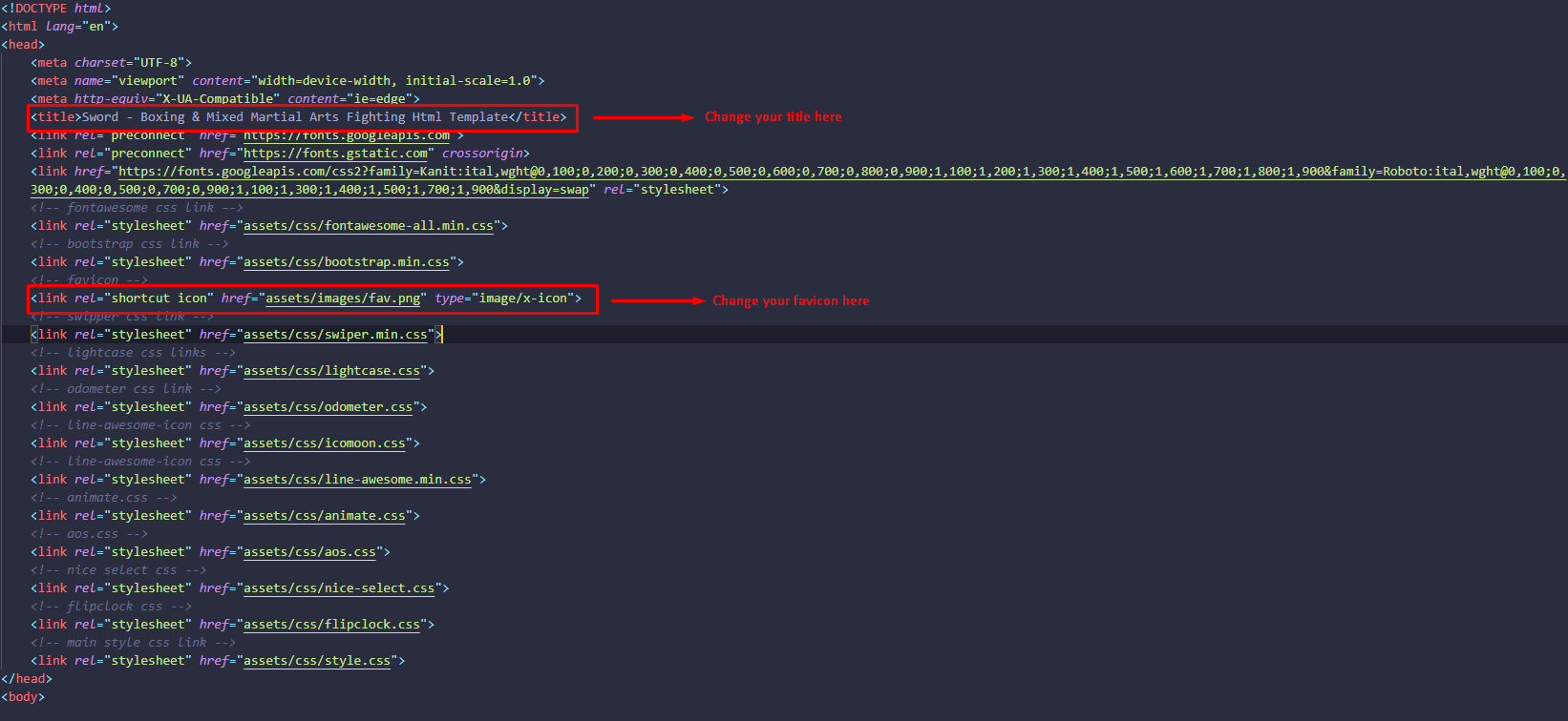
How to Change Site Title And Favicon Icon
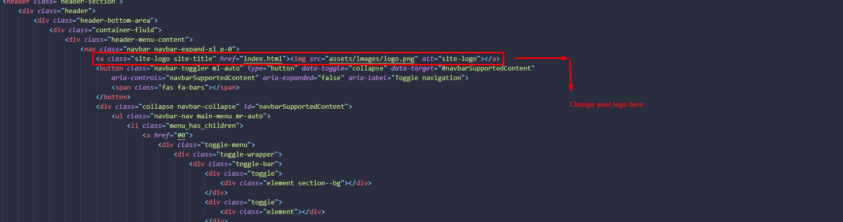
How to Change Logo
How to Change Your Menu Title
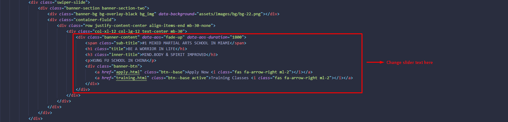
How to Change Slider Image and Text
How to Change Phone Number, E-Mail Address and Address

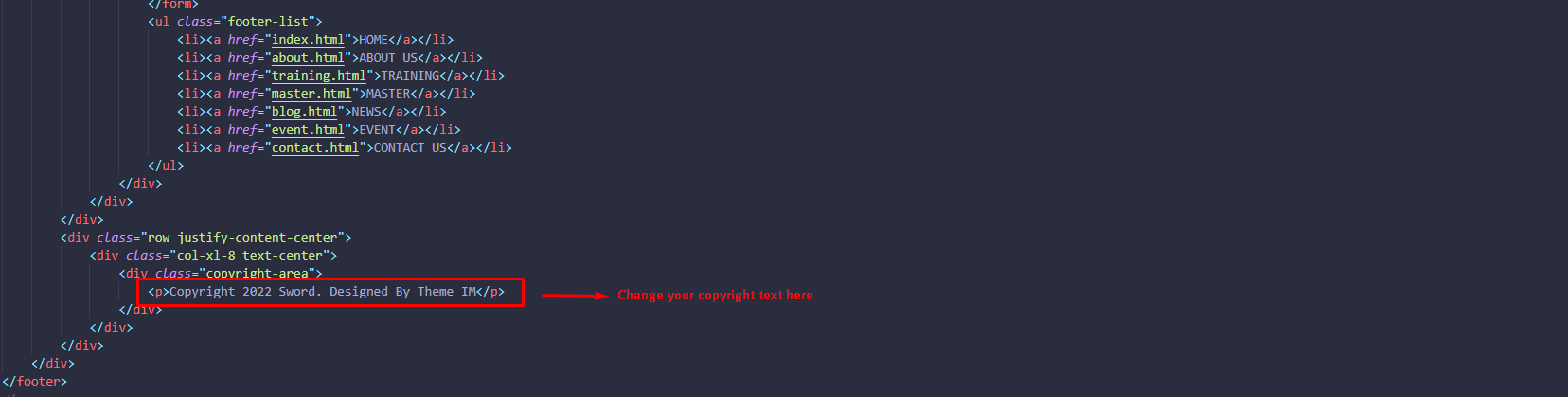
How to Change Copyright Text
HTML Structure
   <!-- Banner Column Start-->
   <div class="col-xl-6 col-lg-12 mb-30">
    <div class="banner-content" data-aos="fade-right" data-aos-duration="1800">
        <span class="sub-title">WELCOME TO SWORD</span>
        <h1 class="title">EVERY GREAT</h1>
        <h3 class="inner-title">JOURNEY STARTS WITH ONE STEP!</h3>
        <p>Morbi eleifend tortor vitae sapien laoreet feugiat. Aliquam dictum vulputate sapien eu laoreet. Aliquam purus est, molestie et sagittis sit amet, sagittis in magna. Morbi placerat commodo luctus. Etiam pulvinar dapibus risus, sit amet consectetur metus lobortis vitae.</p>
        <div class="banner-arrow">
            <img src="assets/images/element/element-10.png" alt="element">
        </div>
        <div class="banner-widget">
            <div class="banner-widget-wrapper">
                <div class="banner-widget-left">
                    <div class="banner-widget-thumb">
                        <img src="assets/images/element/element-9.png" alt="element">
                    </div>
                </div>
                <div class="banner-widget-middle">
                    <div class="banner-widget-content">
                        <p class="text-white">Join over 4,000+ students</p>
                    </div>
                </div>
                <div class="banner-widget-right">
                    <div class="banner-widget-btn">
                        <a href="apply.html" class="btn--base">Apply Now <i class="fas fa-arrow-right ml-2"></i></a>
                    </div>
                </div>
            </div>
        </div>
    </div>
</div>
  <!-- Banner Column End-->
CSS Structure
            /*---------------------
                Banner Column
            ----------------------*/

            .banner-content{
              position: relative;
              z-index: 9;
              @media only screen and (max-width: 1490px) {
                  width: 90%;
              }
              @media only screen and (max-width: 1299px) {
                  width: 100%;
              }
              @media only screen and (max-width: 1199px) {
                  text-align: center;
              }
              .sub-title{
                  font-weight: 700;
                  font-size: 20px;
                  color: $text--base;
                  font-family: $font_heading;
                  font-style: italic;
                  margin-bottom: 5px;
                  @media only screen and (max-width: 991px) {
                      font-size: 16px;
                  }
                  span{
                      color: $text--base;
                  }
              }
              .title{
                  margin-bottom: 0;
                  font-weight: 700;
                  font-style: italic;
                  @media only screen and (max-width: 991px) {
                      margin-bottom: 10px;
                  }
              }
              p{
                  @media only screen and (max-width: 575px) {
                      display: none;
                  }
              }
              .inner-title{
                  font-size: 45px;
                  font-weight: 700;
                  font-style: italic;
                  margin-bottom: 25px;
                  @media only screen and (max-width: 991px) {
                      font-size: 22px;
                      margin-bottom: 15px;
                  }
              }
          }
      }
      .banner-arrow{
          margin-top: 40px;
          margin-left: 30px;
      }
      .banner-widget-wrapper{
          display: flex;
          flex-wrap: wrap;
          align-items: center;
          justify-content: space-between;
          background-color: $section--bg;
          border-radius: 999px;
          padding: 20px;
          width: 80%;
          margin-top: 30px;
          position: relative;
          z-index: 9;
          @media only screen and (max-width: 1700px) {
              width: 100%;
          }
          @media only screen and (max-width: 630px) {
              width: 100%;
              justify-content: center;
              padding: 10px;
          }
          @media only screen and (max-width: 575px) {
              justify-content: space-between;
          }
          *{
              z-index: 9;
              margin: 2px;
          }
          &::before{
              position: absolute;
              content: '';
              bottom: -20px;
              left: -20px;
              width: 100%;
              height: 100%;
              border: 1px dashed rgba($bg--base, 0.5);
              border-radius: 999px;
              z-index: -1;
              @media only screen and (max-width: 991px) {
                  left: -5px;
                  bottom: -5px;
              }
          }
          &::after{
              position: absolute;
              content: '';
              bottom: 0;
              left: 0;
              width: 100%;
              height: 100%;
              background-color: $section--bg;
              border-radius: 999px;
              z-index: 2;
          }
          .banner-widget-btn{
              a{
                  @media only screen and (max-width: 1366px) {
                      padding: 10px 20px;
                  }
              }
          }
      }
Sources & Credits
- Fonts
- Icons
- CSS
- JS
Supports
Thank you for reading the documentaion. If you still have any question or any problem, please contact with us. We will give you best support. Thanks.
Themeim